2. Preparing Data for Spatial Accessibility Analysis
Source:vignettes/spax-102-data-prep.Rmd
spax-102-data-prep.Rmd
# Load required packages
library(spax)
#> Error in get(paste0(generic, ".", class), envir = get_method_env()) :
#>   object 'type_sum.accel' not found
library(terra)
library(tidyverse)
library(sf)
library(osrm)
Data Preparation for Accessibility Analysis
“Give me six hours to chop down a tree, and I will spend the first four sharpening the axe.”
— Abraham Lincoln(?)
Overview
Spatial accessibility analysis requires three key components:
Demand: Population or service need distribution
Supply: Service locations and their capacities
Distance: Travel time or distance between demand and supply
This guide walks through preparing each component for use with
spax.
Dealing with Demand
When preparing demand data for spatial accessibility analysis, we have several approaches available, each with its own assumptions and trade-offs. Let’s explore these methods using a simple example of disease cases by province.
set.seed(42) # For reproducibility

# Example district-level case data
case_data <- tibble(
  ADM1_PCODE = bound1$ADM1_PCODE,
  cases = round(rnorm(nrow(bound1), 1000, 200)) # Simulated disease cases
)

# Join with spatial data
case_spatial <- bound1 |>
  left_join(case_data, by = "ADM1_PCODE")
In a vector-based approach, we typically represent each area with a polygon that has an attribute for the number of cases. This often results in choropleth maps, like this:
# Plot the case
ggplot() +
  geom_sf(data = bound1) +
  geom_sf(data = case_spatial, aes(fill = cases)) +
  labs(title = "Cases by Province") +
  scale_fill_viridis_b() +
  theme_minimal()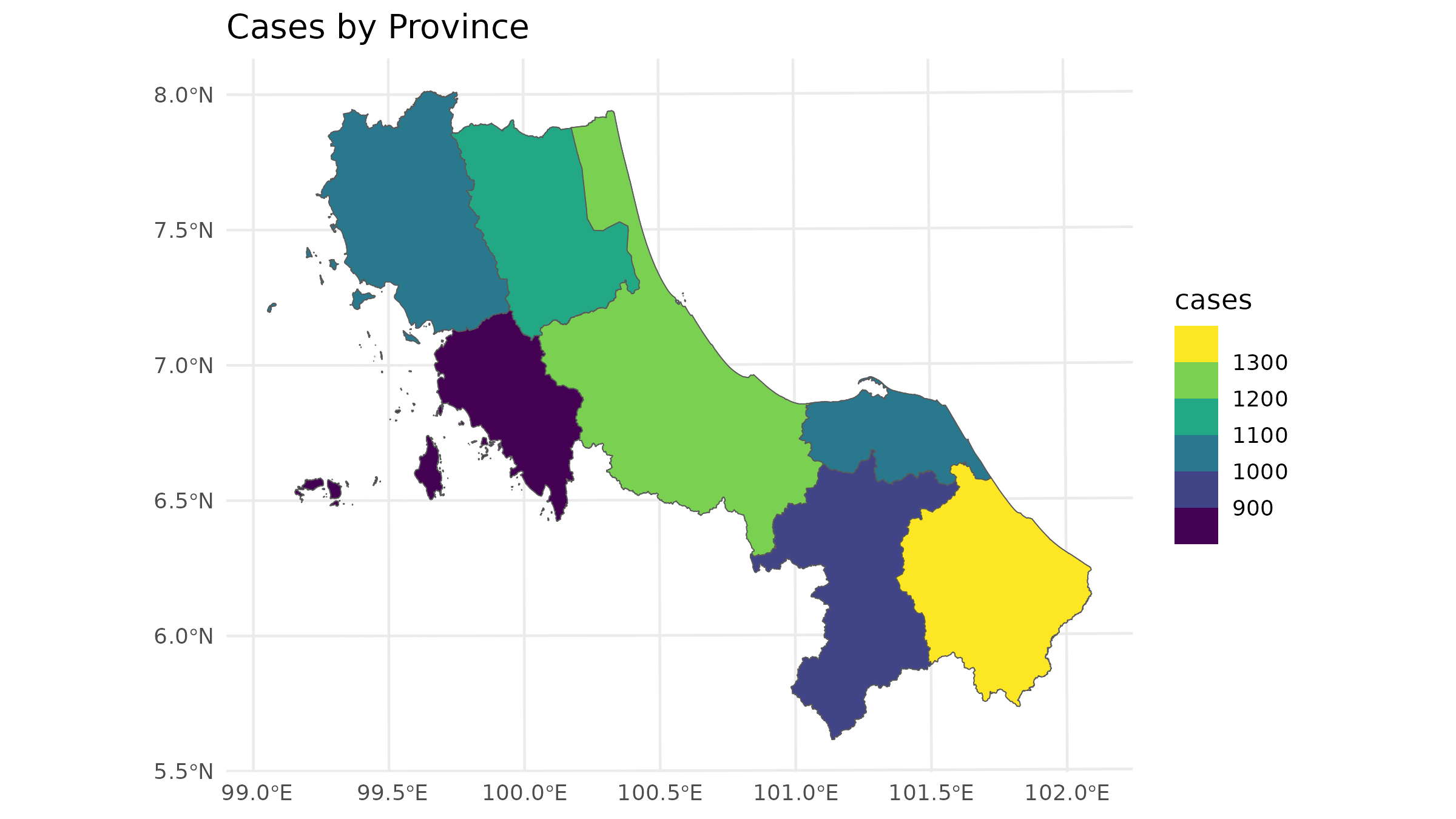
But that could sometimes be misleading since in traditional spatial analysis, we often allocate demand to only the centroid of each area:
# Calculate centroids and rasterize
centroids <- st_centroid(case_spatial)
#> Warning: st_centroid assumes attributes are constant over geometries

# Plot the population data
ggplot() +
  geom_sf(data = bound1) +
  geom_sf(data = centroids, aes(size = cases), col = "red") +
  labs(title = "Population Data by Region") +
  theme_minimal()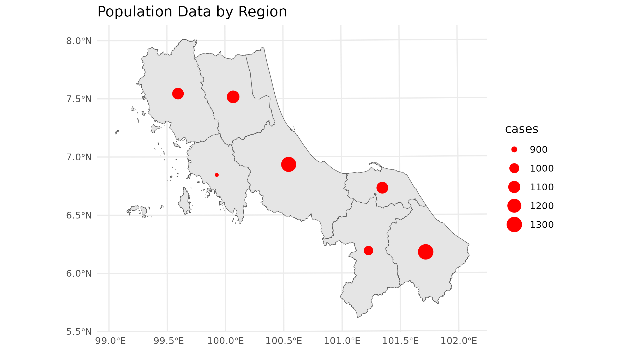
The centroid approach works for vector-centric analysis, but for
spax, we need to think in terms of continuous surfaces.
Let’s explore different ways to convert our data
1. Centroid-Based Approach
The simplest approach treats all demand as concentrated at area centroids. This mirrors traditional vector-based accessibility analyses but in raster format:
# Load population density raster & distance
u5pd <- read_spax_example("u5pd.tif")
hos_iscr <- read_spax_example("hos_iscr.tif")

# Create template raster - Coarser resolution for example
template <- aggregate(u5pd, fact = 10)

# Rasterize centroids
centroid_demand <- terra::rasterize(
  vect(centroids),
  template,
  field = "cases",
  fun = "sum"
)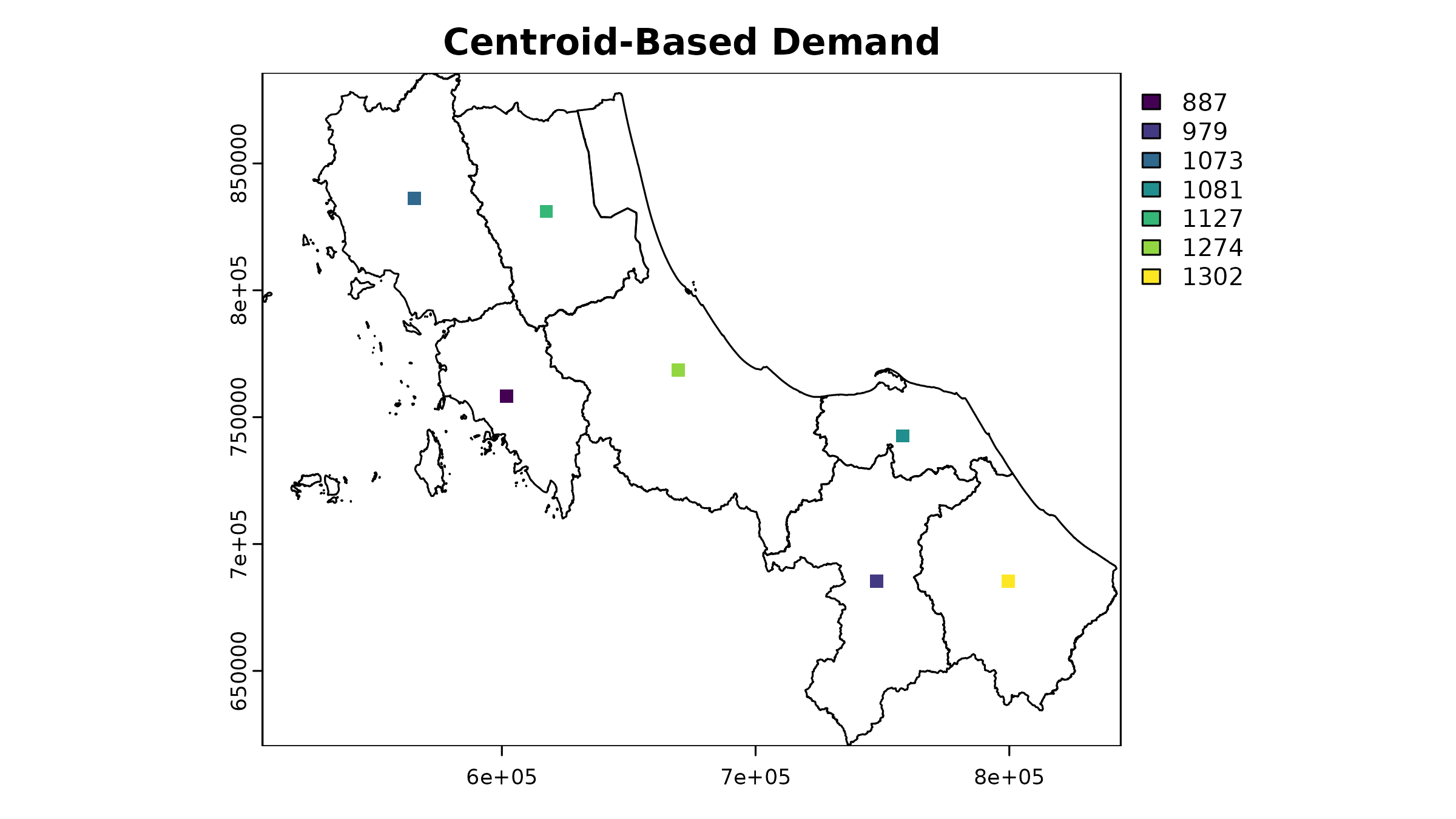
As you can see, this approach creates a somewhat odd-looking result - all our demand is concentrated in single cells. However, this raster can still be used in accessibility analysis, just like the original population density raster. The key trade-off here is between simplicity and spatial accuracy.
2. Area-Weighted Approach [developing]
A more sophisticated method distributes cases evenly across each province’s area:
# 1. Calculate case density
case_spatial <- case_spatial |>
  mutate(
    area_m2 = st_area(case_spatial), # estimate area
    case_density = as.numeric(cases / area_m2) # calc density
  )

# 2. Rasterize case density
case_density_raster <- terra::rasterize(
  vect(case_spatial),
  template,
  field = "case_density"
)

# 3. Calculate pixel area in square kilometers
pixel_area <- terra::res(template)[1] * terra::res(template)[2]

# 4. Convert density to absolute cases per pixel
case_raster <- case_density_raster * pixel_area
Let’s see how this looks:
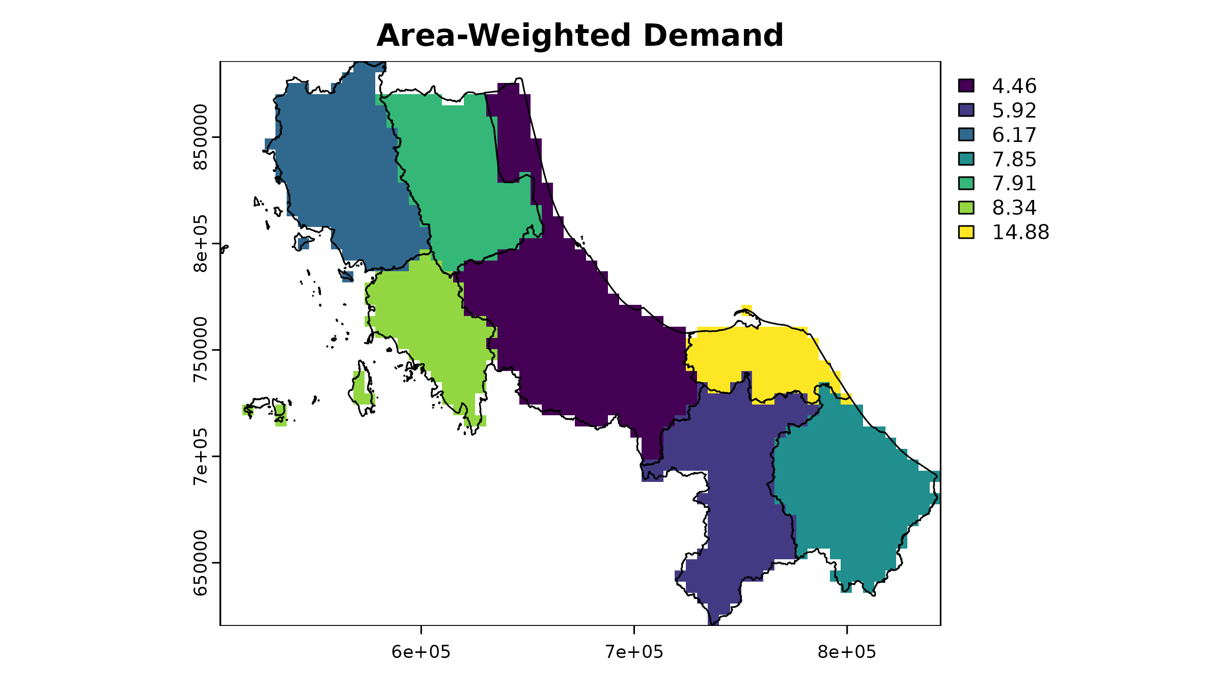
This gives us a more continuous surface, but we should validate that our totals still match:
# Extract raster values for each polygon
extracted_cases <- terra::extract(
  case_raster,
  vect(case_spatial),
  fun = sum, na.rm = TRUE
)

# Compare original vs rasterized totals
case_spatial |>
  st_drop_geometry() |>
  select(ADM1_PCODE, cases) |>
  mutate(
    raster_cases = extracted_cases[, 2],
    difference = abs(cases - raster_cases),
    pct_diff = (difference / cases) * 100
  ) |>
  mutate_if(is.numeric, round, 1)
#>   ADM1_PCODE cases raster_cases difference pct_diff
#> 1       TH90  1274       1261.4       12.6      1.0
#> 2       TH91   887        867.4       19.6      2.2
#> 3       TH92  1073       1068.1        4.9      0.5
#> 4       TH93  1127       1131.1        4.1      0.4
#> 5       TH94  1081       1085.9        4.9      0.5
#> 6       TH95   979        995.2       16.2      1.7
#> 7       TH96  1302       1286.8       15.2      1.2
The differences between original and rasterized values arise from the discretization process. The results get closer as resolution increases, but there’s always a trade-off between accuracy and computational efficiency.
3. Informed Distribution [developing]
Even more realistic distribution is possible using auxiliary data like population density to inform where cases are likely to occur within each province. This section will be expanded in future versions.
4. Probabilistic Sampling [developing]
For uncertainty analysis, spax provides tools to
generate multiple potential demand distributions:
# This advanced approach is covered in detail in the
# "Probabilistic Accessibility Analysis" vignette
?sample_pmf # See documentation for details
The choice of demand preparation method can significantly impact your accessibility analysis results. Consider your specific context:
- Data availability (Do you have population density data?)
- Scale of analysis (Are districts large enough that distribution matters?)
- Purpose (Is point-based analysis sufficient for your needs?)
- Computational resources (Can you handle higher resolution distributions?)
Processing Supply Data
Supply data is usually the most straightforward component - we typically know exactly where facilities are and their capacities. However, these locations play a crucial role in the more complex task of distance calculation that follows..
# Basic Supply Structure
head(hc12_hos) |>
  select(id, hoslvl, s_doc, s_nurse)
#> Simple feature collection with 6 features and 4 fields
#> Geometry type: POINT
#> Dimension:     XY
#> Bounding box:  xmin: 659422 ymin: 744135 xmax: 715990.7 ymax: 824148
#> Projected CRS: WGS 84 / UTM zone 47N
#> # A tibble: 6 × 5
#>   id    hoslvl     s_doc s_nurse            geometry
#>   <chr> <fct>      <int>   <int>         <POINT [m]>
#> 1 c172  3-Regional   522     973 (662036.1 775836.7)
#> 2 c173  2-General    321     706   (672852 789753.3)
#> 3 c174  2-General     67      63     (659422 824148)
#> 4 c175  2-General     81     103     (692195 764766)
#> 5 c176  2-General    175     180   (687203.3 744135)
#> 6 c177  2-General     77     103 (715990.7 752559.6)
For use in spax, supply data should be separated
into:
- Spatial locations (for distance calculations)
- Capacity attributes (for accessibility computations)
# Separate spatial and attribute components
supply_attributes <- hc12_hos |>
st_drop_geometry() |>
select(id, s_doc, s_nurse) # Keep only relevant columns
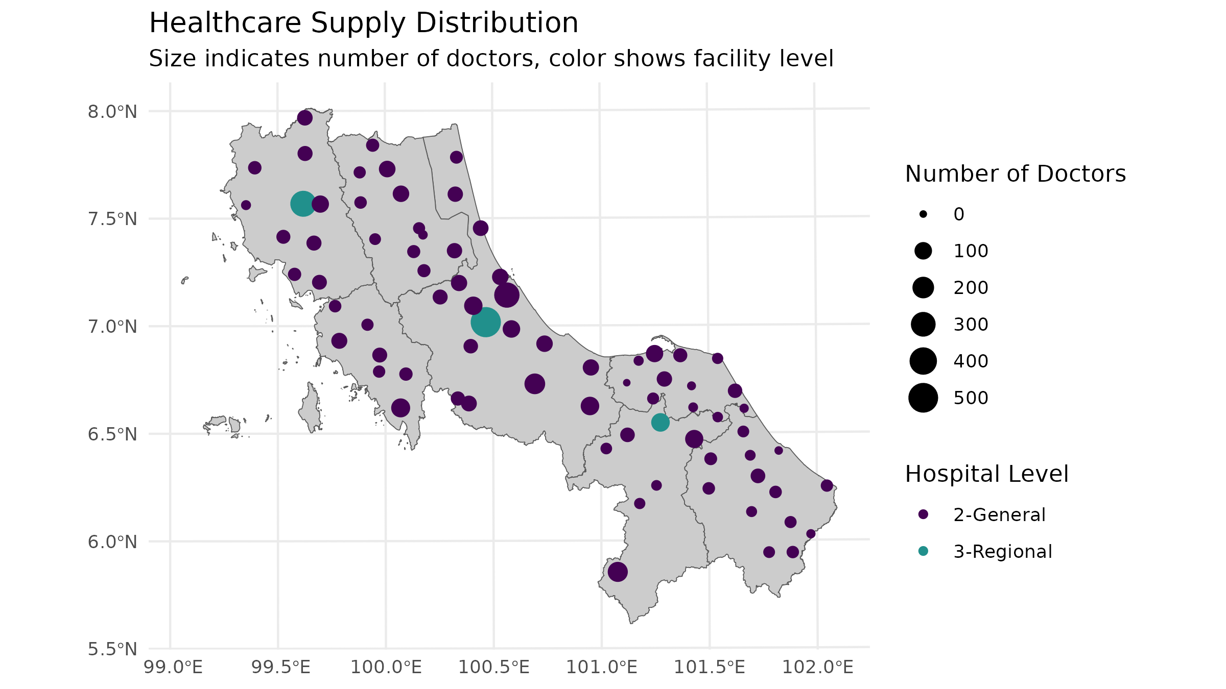
# Visual check of supply distribution
ggplot() +
geom_sf(data = bound1, fill = "grey80") +
geom_sf(data = hc12_hos, aes(size = s_doc, color = hoslvl)) +
scale_size_continuous(name = "Number of Doctors") +
scale_color_viridis_d(name = "Hospital Level", end = 0.5) +
theme_minimal() +
labs(
title = "Healthcare Supply Distribution",
subtitle = "Size indicates number of doctors, color shows facility level"
)
Creating Distance/Travel Time Surfaces
While supply locations themselves are straightforward, calculating distances between supply and demand points is often the most complex part of data preparation. Although it’s theoretically possible to calculate distances from either supply to demand or demand to supply (assuming travel times are symmetric), there are practical reasons why we typically calculate from supply points:
- We usually have fewer supply points than demand points, making computation more efficient
- When redistributing accessibility scores back to the population, we need supply-based distances anyway
Let’s explore different approaches to creating these distance surfaces:
1. Euclidean Distance
The simplest approach - straight-line distances:
# Example for one facility using terra
facility_point <- hc12_hos[1, ]
template_rast <- u5pd # Use population raster as template

# Calculate Euclidean distance (in meters since our CRS is projected)
euclidean_dist <- terra::distance(
  template_rast,
  vect(facility_point)
) |> crop(vect(bound0), mask = TRUE)
#> |---------|---------|---------|---------|=========================================
# Plot the Euclidean distance
plot(euclidean_dist / 1000, # Convert to kilometers
  main = "Euclidean Distance (km)"
)
plot(vect(facility_point), add = TRUE, col = "red", pch = 16)
plot(vect(bound0), add = TRUE)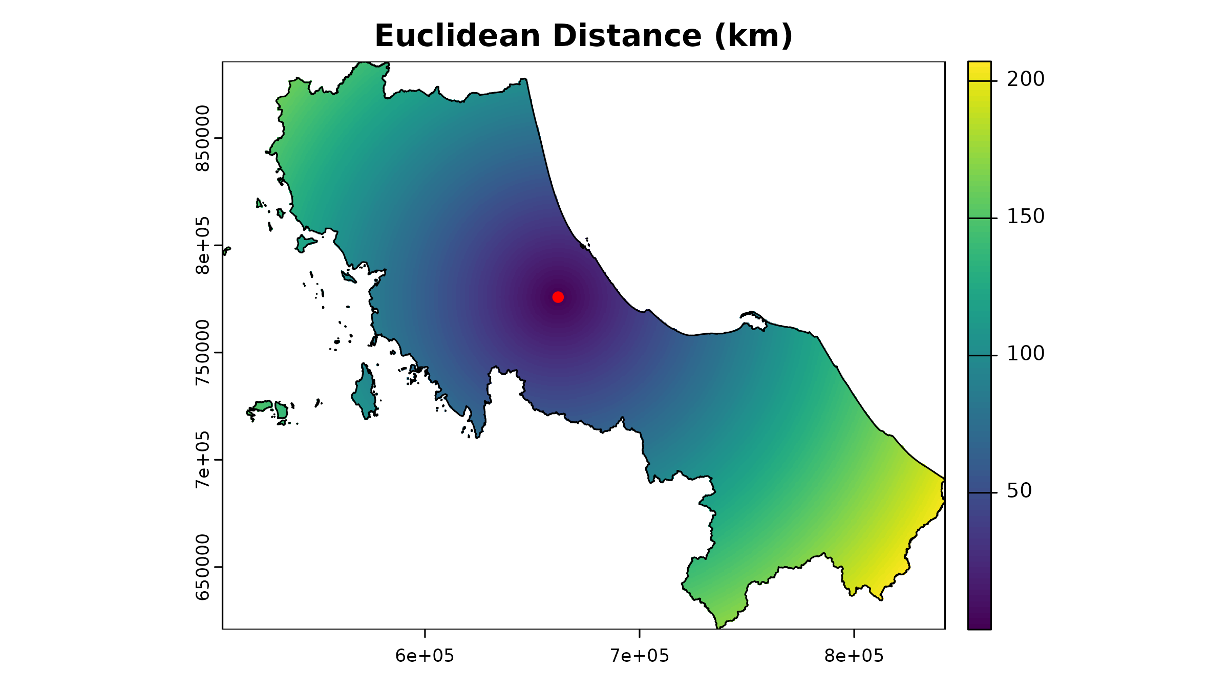
While simple, this approach ignores real-world travel constraints like roads and barriers. It’s most useful for:
Initial exploratory analysis
Areas with relatively uniform transportation networks
Services that aren’t strictly road-dependent
2. Travel Time Isochrones
A more realistic approach uses travel time isochrones - areas
reachable within specific time thresholds. While spax
doesn’t generate isochrones directly, we can use tools like the osrm package:
# Example: Calculate isochrones for the first hospital
# Since our data is in a planar projection, we need to transform it to WGS84 (EPSG:4326) for routing services

example_hos1 <- hc12_hos[1, ] |> # Select the first hospital
  st_transform(4326) |> # Transform to WGS84 (geodesic projection)
  st_coordinates() |> # Extract coordinates
  as.numeric() # Convert to numeric

# Calculate isochrones
example_isochrone <- osrmIsochrone(
  loc = example_hos1, # Example coordinates
  breaks = c(15, 30, 45, 60), # 15-minute intervals
  res = 30
)

# Transform back to our working CRS
example_isochrone <- st_transform(example_isochrone, st_crs(bound0))

# Plot results
par(mfrow = c(1, 2))
plot(example_isochrone[, "isomax"], main = "Travel Time Isochrone for Hospital C1")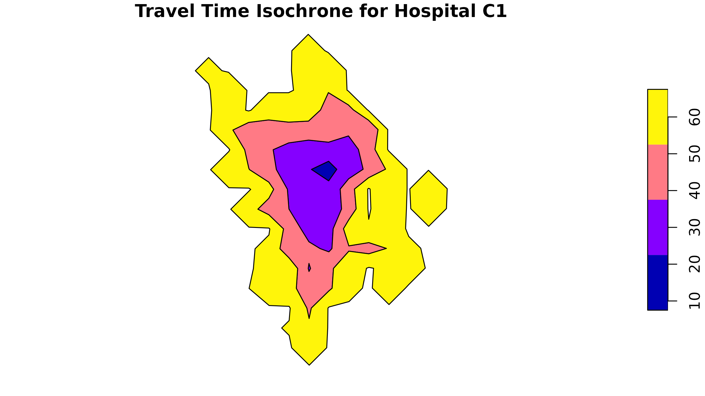
plot(example_isochrone[3, "isomax"], main = "Travel Time Isochrone ring for Hospital C1 (45 mins)")
The isochrones show travel time “rings” around our facility. If you
take on a vector-based approach, you can use functions like sf::st_contains()
to determine the population within each isochrone ring.
For spax, we need to convert these to a raster
format:
# Prepare isochrones for rasterization
example_isochrone <- example_isochrone |>
  mutate(
    iso_mean = (isomin + isomax) / 2,
    location_id = hc12_hos[1, ]$id
  )

# Convert to raster format
example_raster <- terra::rasterize(
  x = example_isochrone,
  y = template_rast,
  field = "iso_mean", # Fill the raster with the isomax values
  background = NA,
  fun = "sum",
  by = "location_id"
) |>
  crop(vect(bound0), mask = TRUE)
# Plot
plot(example_raster, main = "Travel Time Isochrone for Hospital C1")
plot(vect(bound0), add = TRUE)
plot(vect(hc12_hos[1, ]), add = TRUE, col = "red", pch = 16)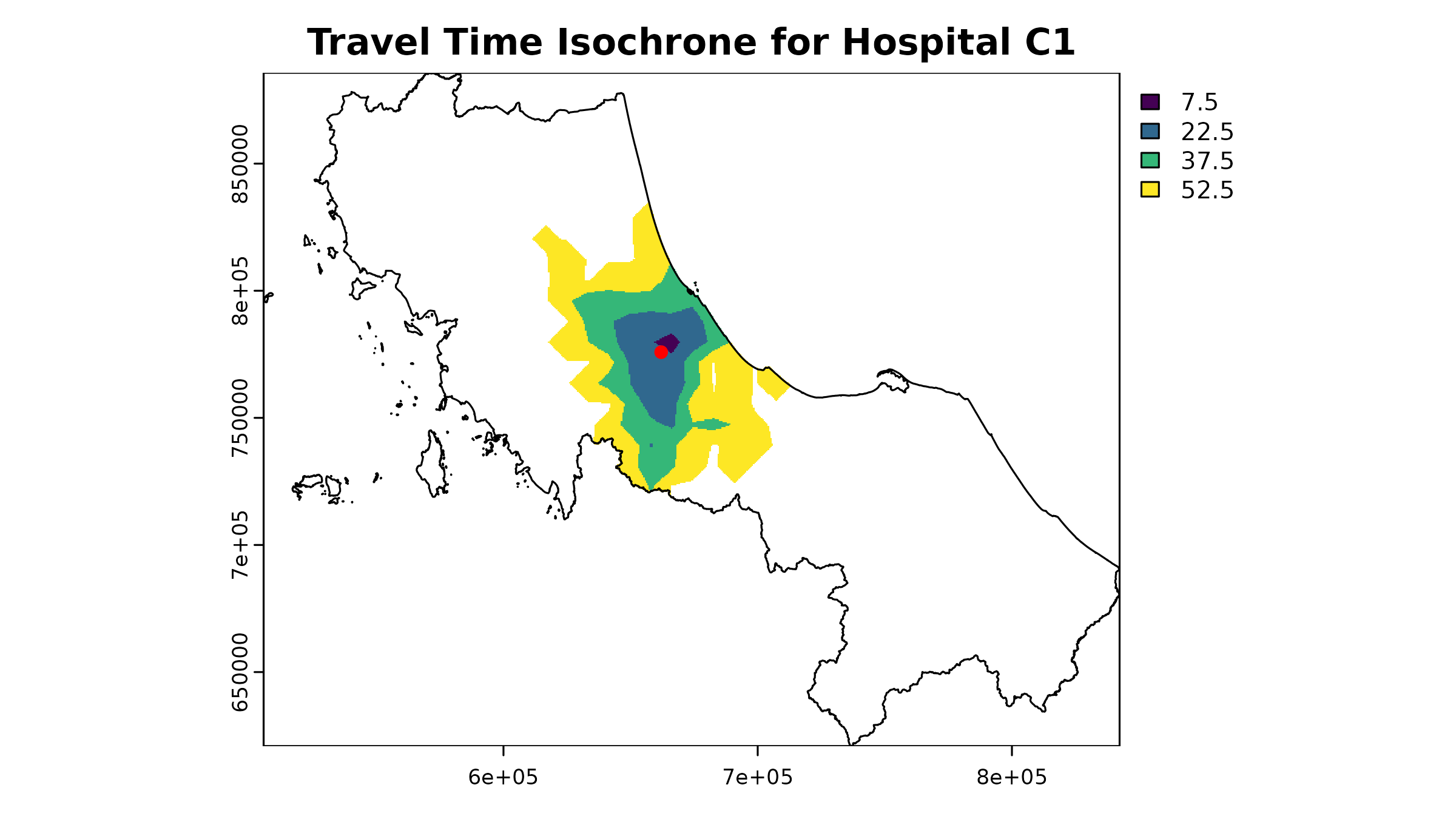
⚠️ Important Note about OSRM: By default, the
osrm::osrmIsochrone()] function uses OSRM’s demo server. This is fine for testing, but for real analysis you should:
Set up your own OSRM server. This vignette does not cover the server setup process.
Consider rate limits (demo server allows ~1 request/second)
Be mindful of server load and ethical usage
To process all facilities, you’d need to loop through them:
# Example code (not run due to API limitations)

# Initialize a list to store isochrones
isochrones <- list(rep(NA, nrow(hc12_hos)))

# Extract coordinates
hos_coords <- hc12_hos |>
  st_transform(4326) |> # only if the data is in planar projection
  st_coordinates()

# Loop over each hospital - lapply
isochrones <- lapply(1:nrow(hc12_hos), function(i) {
  # Calculate isochrone
  osrmIsochrone(
    loc = hos_coords[i, ],
    breaks = c(15, 30, 45, 60),
    res = 30
  )
})
# Then proceed to rastarization ...
Service Provider Options
When creating travel time surfaces, you have several options:
OSRM (Open Source Routing Machine)
- ✓ Free and open source
- ✓ Can handle multiple travel modes (if setup properly)
- × Requires server setup for serious use
- × Basic routing without traffic
Commercial APIs (HERE, Google Maps)
- ✓ Includes real-time traffic
- ✓ More accurate travel times
- × Usage costs
- × API limits
Custom cost surfaces (I have no idea how to do this, lol)
- ✓ Can include terrain, land use
- ✓ Full control over parameters
- × Requires GIS expertise
- × More complex to validate
Validating Your Data: Essential Checks Before Analysis
Before running any accessibility analysis, it’s crucial to validate your prepared data. Here’s a systematic approach to validation (some of which already implemented in the package:) :
1. Spatial Alignment
All raster inputs must align perfectly - same extent, resolution, and projection:
# Example:
# You might want to create function to summarize raster properties
summarize_raster <- function(r, name) {
  tibble(
    Dataset = name,
    Resolution = paste(round(res(r), 2), collapse = " x "),
    Extent = paste(round(as.vector(ext(r)), 2), collapse = ", "),
    CRS = crs(r, proj = TRUE)
  )
}

# Compare properties of key rasters
raster_props <- bind_rows(
  summarize_raster(u5pd, "Population"),
  summarize_raster(hos_iscr, "Travel Time")
)

raster_props
#> # A tibble: 2 × 4
#>   Dataset     Resolution    Extent                                     CRS
#>   <chr>       <chr>         <chr>                                      <chr>
#> 1 Population  520.4 x 520.4 505646.53, 842347.77, 620843.72, 885729.24 +proj=ut…
#> 2 Travel Time 520.4 x 520.4 505646.53, 842347.77, 620843.72, 885729.24 +proj=ut…

# Visual check for alignment
plot(u5pd, main = "Spatial Alignment Check")
plot(hos_iscr[[1]], add = TRUE, alpha = 0.5)
plot(vect(bound1), add = TRUE)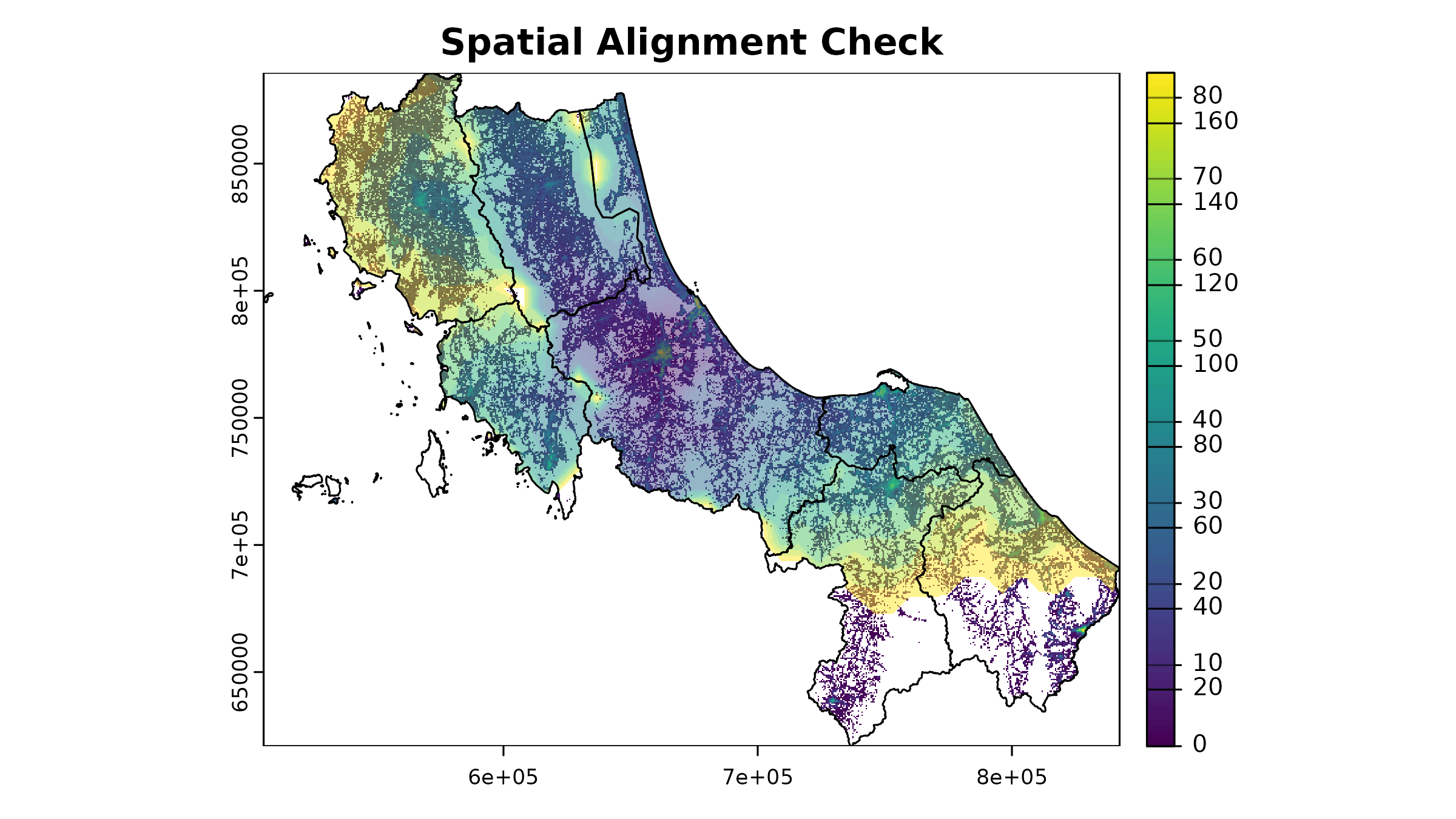
2. Value Range Validation
Check for reasonable values in your input data:
# Check population density range
summary(u5pd)
#> Warning: [summary] used a sample
#>  tha_children_under_five_2020
#>  Min.   : 0.00
#>  1st Qu.: 1.40
#>  Median : 3.48
#>  Mean   : 6.03
#>  3rd Qu.: 7.59
#>  Max.   :82.96
#>  NA's   :84773

# Check a few travel time rasters
summary(hos_iscr[[1:10]])
#> Warning: [summary] used a sample
#>       c172            c173            c174            c175
#>  Min.   :  6.0   Min.   :  3.0   Min.   :  3.5   Min.   :  4.0
#>  1st Qu.: 67.5   1st Qu.: 67.5   1st Qu.: 82.5   1st Qu.: 67.5
#>  Median : 97.5   Median :112.5   Median :127.5   Median :112.5
#>  Mean   :102.9   Mean   :107.6   Mean   :118.9   Mean   :105.6
#>  3rd Qu.:142.5   3rd Qu.:142.5   3rd Qu.:157.5   3rd Qu.:142.5
#>  Max.   :172.5   Max.   :172.5   Max.   :172.5   Max.   :172.5
#>  NA's   :71579   NA's   :71501   NA's   :74191   NA's   :69709
#>       c176            c177            c178            c179
#>  Min.   :  8.5   Min.   : 11.0   Min.   : 11.0   Min.   :  7.5
#>  1st Qu.: 67.5   1st Qu.: 67.5   1st Qu.: 67.5   1st Qu.: 97.5
#>  Median :112.5   Median :112.5   Median :112.5   Median :127.5
#>  Mean   :107.5   Mean   :107.7   Mean   :110.5   Mean   :120.5
#>  3rd Qu.:142.5   3rd Qu.:142.5   3rd Qu.:157.5   3rd Qu.:157.5
#>  Max.   :172.5   Max.   :172.5   Max.   :172.5   Max.   :172.5
#>  NA's   :70996   NA's   :72338   NA's   :74213   NA's   :75822
#>       c180            c181
#>  Min.   :  5.0   Min.   :  8.50
#>  1st Qu.: 97.5   1st Qu.: 67.50
#>  Median :127.5   Median : 97.50
#>  Mean   :127.3   Mean   : 96.85
#>  3rd Qu.:157.5   3rd Qu.:127.50
#>  Max.   :172.5   Max.   :172.50
#>  NA's   :76037   NA's   :72831
3. Missing Value Analysis
Understand where and why you have NA values; note that not all NAs are bad:
# Function to analyze NA patterns within boundary
# PS. Will be implemented in the package later
analyze_nas <- function(r, name, bound = bound0) {
  # Create mask from boundary
  mask <- terra::rasterize(bound, r)

  # Count cells only within boundary
  cells_in_boundary <- global(!is.na(mask), "sum")$sum
  nas_in_boundary <- global(is.na(r) & !is.na(mask), "sum")$sum

  cat(
    sprintf("%s:\n", name),
    sprintf(
      "  NA cells within boundary: %d (%.1f%% of study area)\n",
      nas_in_boundary,
      100 * nas_in_boundary / cells_in_boundary
    )
  )

  # Visualize NA pattern
  na_map <- (is.na(r) & !is.na(mask)) |> crop(bound, mask = T)

  plot(na_map,
    main = paste(name, "- NAs within Study Area"),
    col = c("grey80", "red"),
    legend = FALSE
  )
  plot(vect(bound1), add = TRUE)
  legend("bottomright",
    legend = c("Data present", "NA"),
    fill = c("grey80", "red"),
    bty = "n"
  )
}

# Check NA patterns in key datasets
par(mfrow = c(1, 2))
analyze_nas(u5pd, "Pop")
#> Pop:
#>    NA cells within boundary: 60551 (54.4% of study area)
analyze_nas(hos_iscr[[1]], "Time from 1st Fac")
#> Time from 1st Fac:
#>    NA cells within boundary: 16841 (15.1% of study area)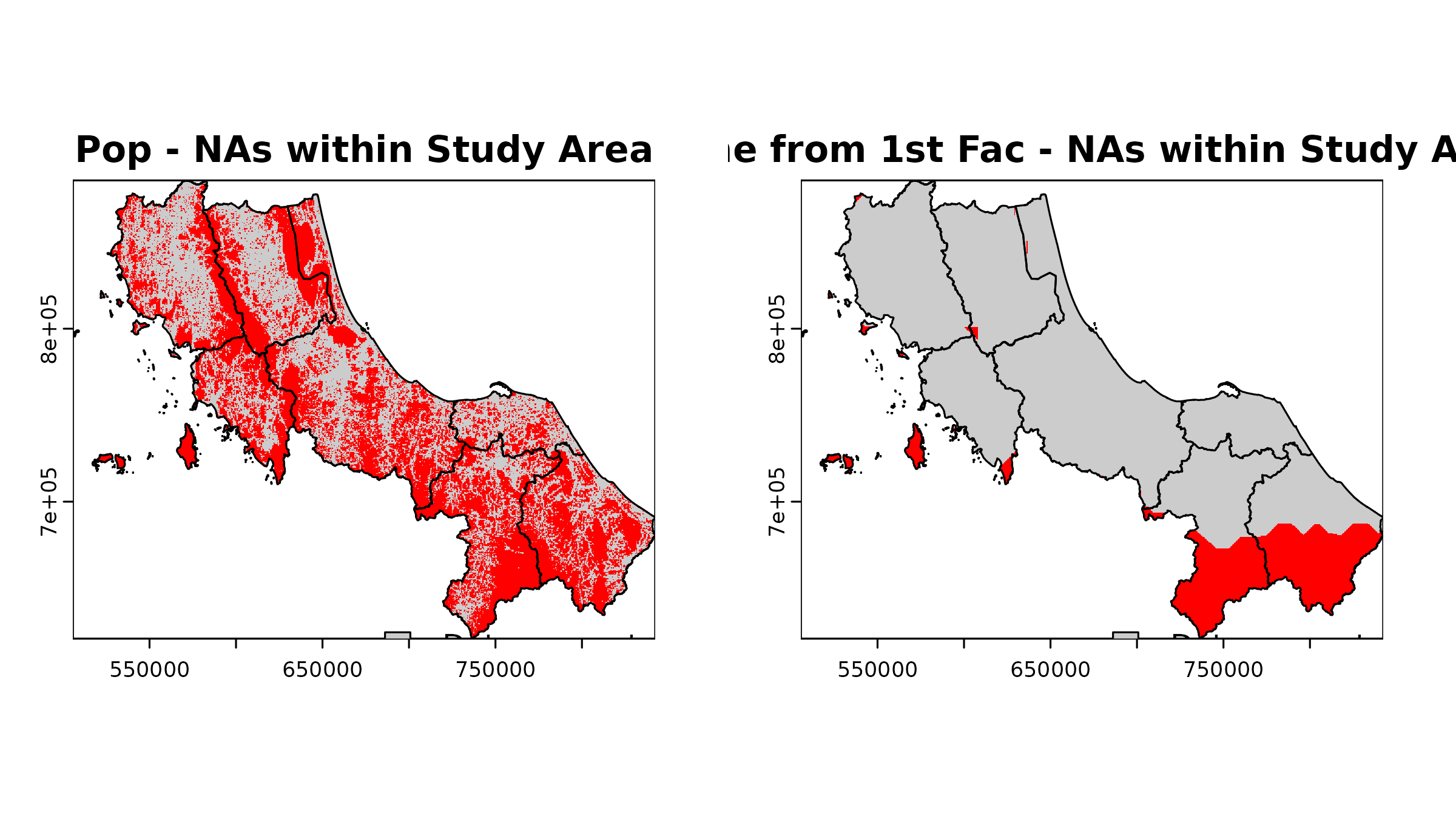
Final reminders:
-
Resolution Selection
- Higher resolution ≠ better analysis
- Consider computational resources
- Match resolution to spatial scale of research question
-
Coordinate Reference Systems
- Be consistent with CRS across all datasets
- Document CRS choices and transformations
- Consider distortion implications
-
Documentation
- Note data sources and dates
- Document all preprocessing steps
- Record assumptions made
- Note known limitations